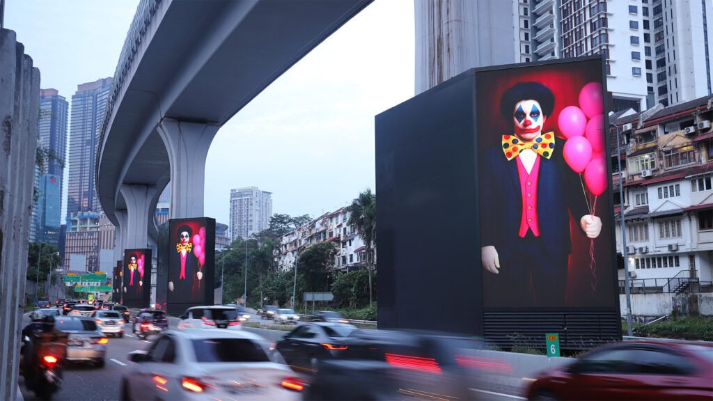

With only a few seconds to spare from the audience, you need your visual to immediately signal who you are. The best way is to let your brand colours lead, as colour is one of the most recognisable brand assets.
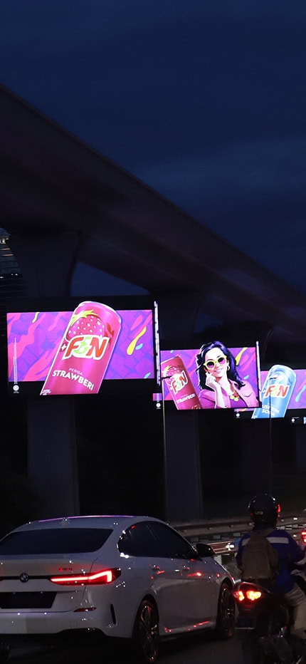
F&N’s creative execution across this Beamer Series is a good example of how choosing the right colour can uplift your OOH visual. Punchy purple with colourful streaks — these colours aren’t just decorative. They were designed to evoke emotion, capture attention and reinforce brand identity. With little to no copy, the visual practically speaks for itself.
Here are a few takeaways for those looking to make their billboard cut through the advertising clutter:
Use vibrant, high-contrast colours
On fast-moving roads, legibility is key. Contrasting colours like purple and orange can create instant visibility and recall in outdoor environments. These vibrant colours pop against both urban and natural backdrops, especially after dark
Align colour with emotion
Want your visual to leave the audience feeling energised, nostalgic or refreshed? Colours carry psychological weight that you can use to your advantage. F&N’s palette evokes fun and youthfulness, which aligns perfectly with their brand tone.
Lead with your brand colours
With only a few seconds to spare from the audience, you need your visual to immediately signal who you are. The best way is to let your brand colours lead, as colour is one of the most recognisable brand assets.
This campaign is proof that when thoughtful colour design meets strategic media placement, the results can be visually magnetic. So, next time you’re planning your OOH campaign, don’t just pick your colours — strategise them.